Brand Identity · bp pulse
bp pulse Brand Guidelines
bp pulse is bp’s EV charging business. This guide shows how its identity works, from purpose and personality to the logo, colour, type and message box, and how I applied it across campaigns, events, sales collateral and product.
Download PDF ↓
Making charging
extraordinarily helpful.
The bp pulse identity, and how I applied it across campaigns, events, sales collateral and product, 2021–2026.
Visual Designer
Inside this guide
extraordinarily helpful.
Simplify
Remove the unnecessary from the charging experience, so getting powered up feels effortless.
Go beyond
Deliver the basics brilliantly, then find smart, extra ways to help drivers and fleet managers.
Be trusted
Backed by bp: reliable, safety-first and setting new standards as a Growth Engine brand.
A savvy
companion.
Every touchpoint should feel like a helpful friend who happens to know a lot about charging.
Smart
In the know, but wears it lightly. Never a bore or a geek; always keeps it simple.
Enthusiastic
Excited to find new ways to help. Listening, supporting and empowering.
On your side
Someone you can rely on to get things done, tell the truth and keep promises.
Nine elements, one system
Chosen by purpose: keep it simple to build brand presence, or add more elements to tell a story.
Logos
The bp pulse wordmark, endorsed by the Helios in its holding shape.
Brand devices
The EOM symbol and the message box, our savvy companion.
Colour
bp pulse blue and bp Engine green lead; secondary colours tell stories.
Typography
Univers for bp in print, Roboto for digital.
Photography
Cut-around, relatable people in the foreground.
Icons & illustration
EV icons joined by connecting lines.
Voice
Simple, humble and empowering.
Sonic
Easy, human and fresh.
Motion
Focuses attention and moves the story forward.
The bp pulse wordmark
A prominent bp prefix combined with the name of the energy solution, in two colours to highlight each part.

Clear space & minimum size
The letter ‘b’ is the unit: it sets the clear space around the wordmark and its minimum height.
bb
Endorsed by bp
Every bp pulse layout carries the bp Helios in a white holding shape. Three rules place it.

charging
now here
Top left
The holding shape hangs from the top edge, set in from the left by half its own width.
Twice the ‘b’
It is always 2× the height of the ‘b’ in the wordmark, so the endorsement stays in balance.
Wordmark signs off
The bp pulse wordmark sits bottom right. The two never lock up together.
Where it could go wrong
Six rules that keep the wordmark and Helios clear and consistent.
Stack the bp letters over pulse
Place the wordmark on secondary colours
Put the wordmark directly on photography
Lock the holding shape up to the wordmark
Centre the holding shape or let it touch an edge
Resize the Helios inside its holding shape
Primary & functional
Blue reflects clean energy; green links to bp. bp pulse blue is the bold background, bp Engine green the highlight.
RGB 0 / 0 / 150
CMYK 100 / 90 / 0 / 7
Pantone 072 C
RGB 155 / 255 / 0
CMYK 40 / 0 / 100 / 0
Pantone 375 C
RGB 0 / 127 / 0
CMYK 100 / 0 / 100 / 0
Pantone 355 C
Secondary colours
Backgrounds for storytelling. Energising colours for upbeat messages, relaxing colours for calm, reassuring ones.
RGB 246 / 146 / 236
Pantone 211 C
RGB 255 / 151 / 148
Pantone 177 C
RGB 175 / 223 / 252
Pantone 310 C
RGB 121 / 229 / 197
Pantone 3533 C
Pair pink with calming blue, or coral with aquamarine.
Two secondary colours at most per campaign.
Balance all four across a campaign so none dominates.
Accessible by default
Only colour pairs that meet WCAG 2.1 AAA carry text. In the message box, headlines lead in white with bp Engine green as the highlight.
✕ bp Engine green for body text
✕ Secondary colours for headlines or copy
✕ bp Engine green as a background
✕ Secondary colours on wayfinding
abcdefghijklmnopqrstuvwxyz
0123456789 · kW · % · $
Univers for bp is used for print. Both keep the brand accessible and consistent.
a trip? See
you there
Headline cap height never exceeds the height of the ‘b’ in the wordmark.
 123456
Anatomy of a story
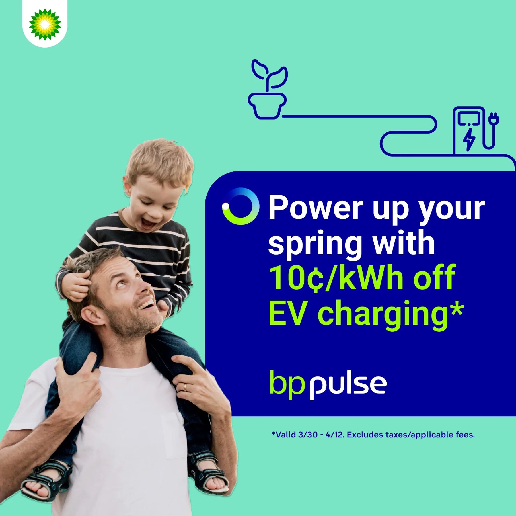
The message box is the savvy companion in visual form. Icons and a connecting line flow into its straight corner; people take the foreground.
- 1Helios in holding shape, top left
- 2EV icons + connecting line
- 3EOM opens the message
- 4Highlight in bp Engine green
- 5Wordmark signs off the box
- 6Cut-around photography
My spring campaign for bp pulse, US.
Space ratios
Each storytelling element gets a share of the layout, so the design stays simple and clear.
Presence or story
Choose elements by purpose. Keep it simple to build recognition; add colour, icons and people to tell a story.
Brand presence
Primary colours, wordmark and EOM, one short message. For signage, wayfinding and events.
Storytelling
Adds a secondary colour, the message box, icons with connecting lines and cut-around photography.
Simple. Functional. Human.
EV icons link bp pulse to charging, joined by a single connecting line. Illustrations exist to solve a customer need, never as decoration.
Simple
Line drawings only, one consistent weight, nothing filled. 2D over 3D.
Functional
Every line has a purpose. Up to three icons, all the same colour, the smallest no less than 70% of the largest.
Human
Flowing lines and rounded corners. Lines connect to the message box’s straight corner and never cross photography.
Humble.
Empowering.
We sound like a savvy, loyal and helpful friend: human and easy to be around.
“Going on a trip? See you there.”
“Chase sticks, not chargers.”
“I’m ready! Plug me in. Tap to pay.”
Sonic and motion follow the same voice: easy, human and fresh.
The brand,
applied.
From social campaigns to trade-show booths, a selection of bp pulse work I designed within this system.
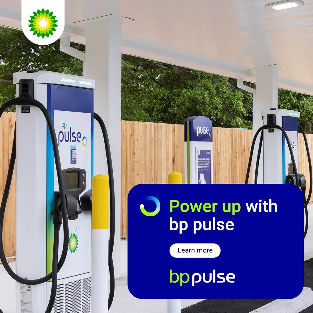
Campaigns & social
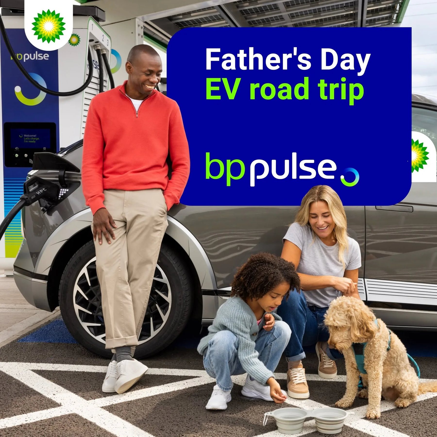
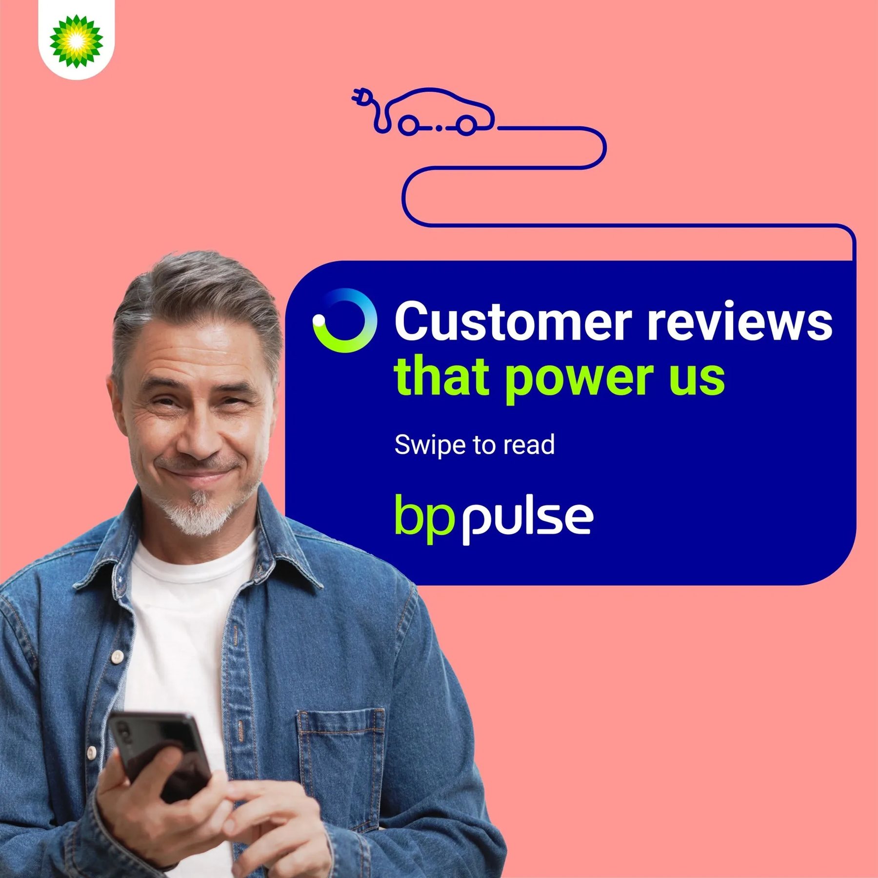
Photography, a rounded message box, the EOM opening every headline and the wordmark signing off.
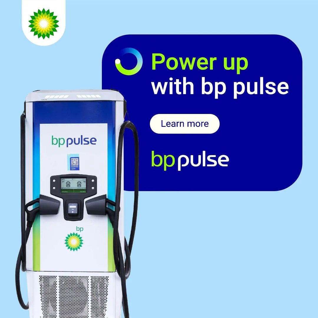
Moments & messages
Seasonal and product stories keep the same message box, so every post is recognisable before you read it.

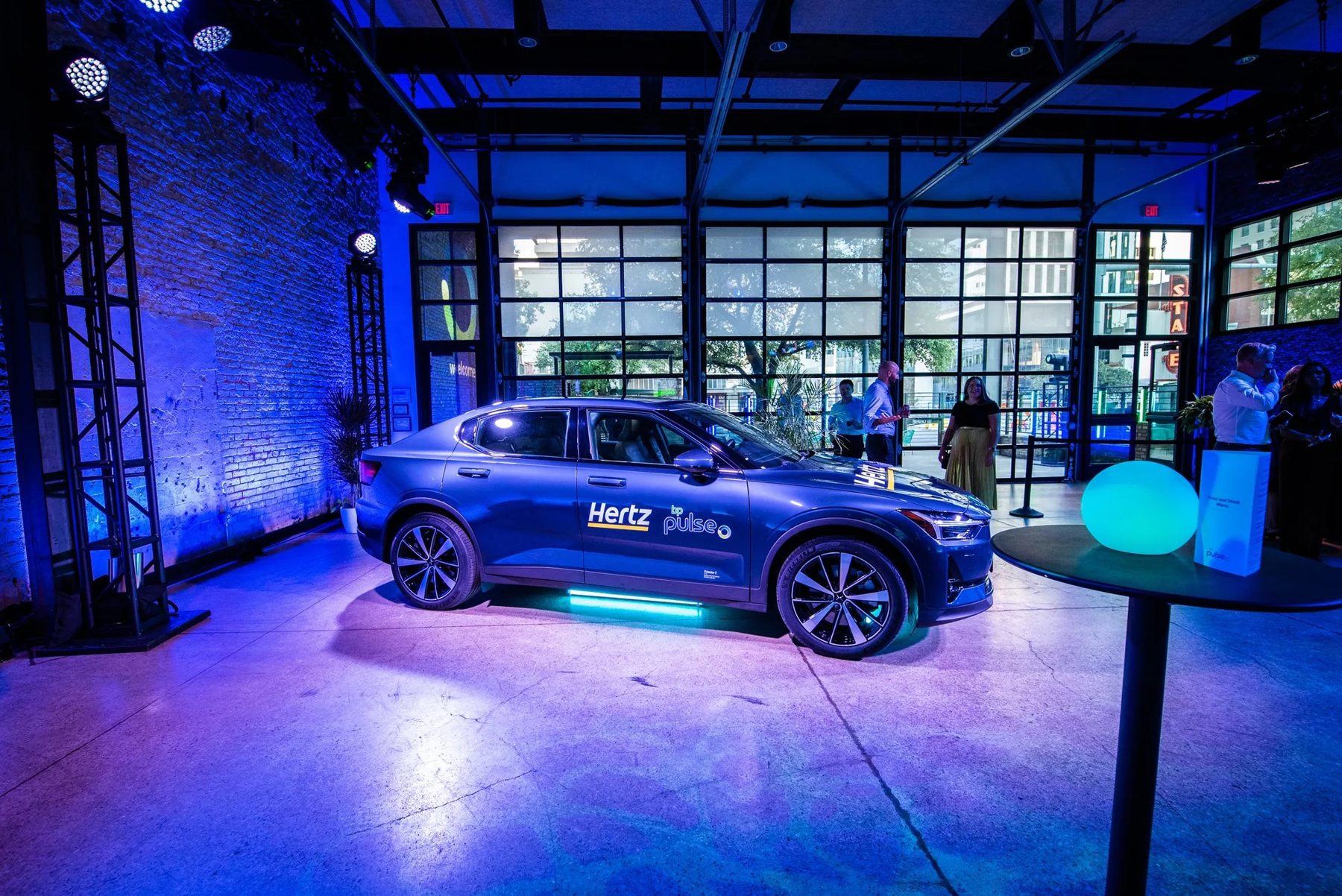
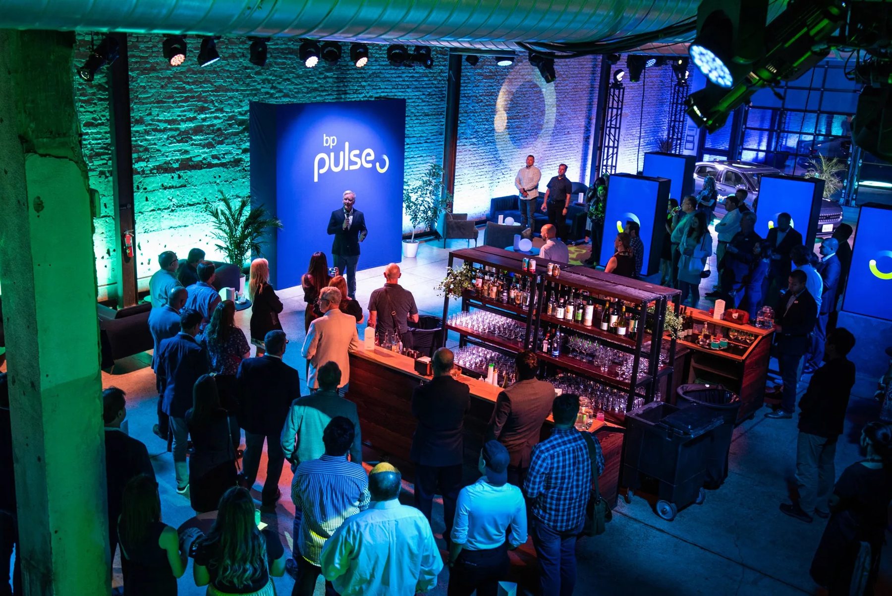
Events & environments
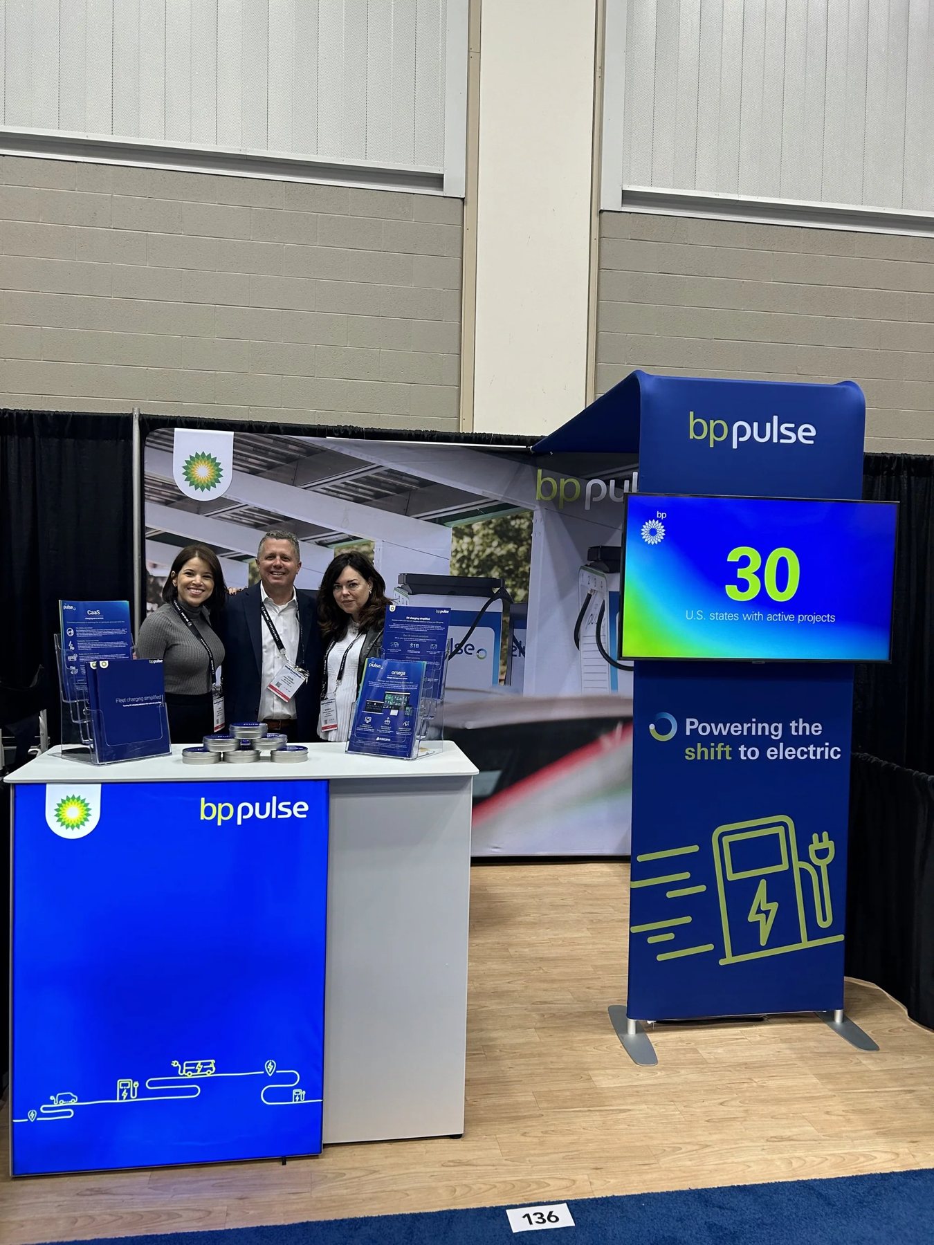
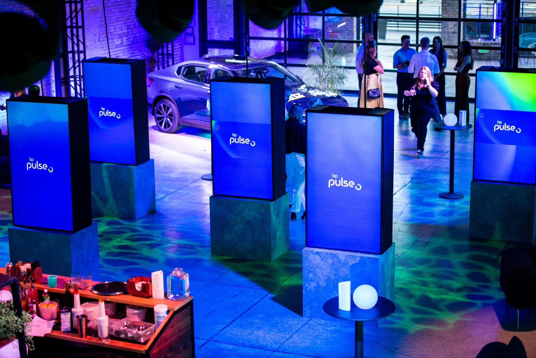
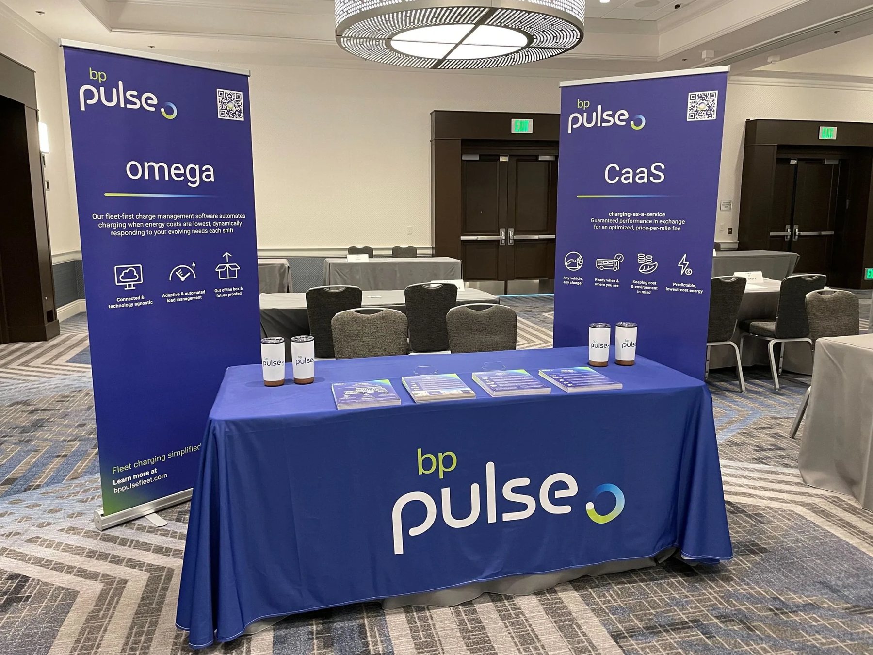
At trade shows and launch events the brand scales up: bp pulse blue structures, bold wordmarks and short, helpful messages.
Sales & print
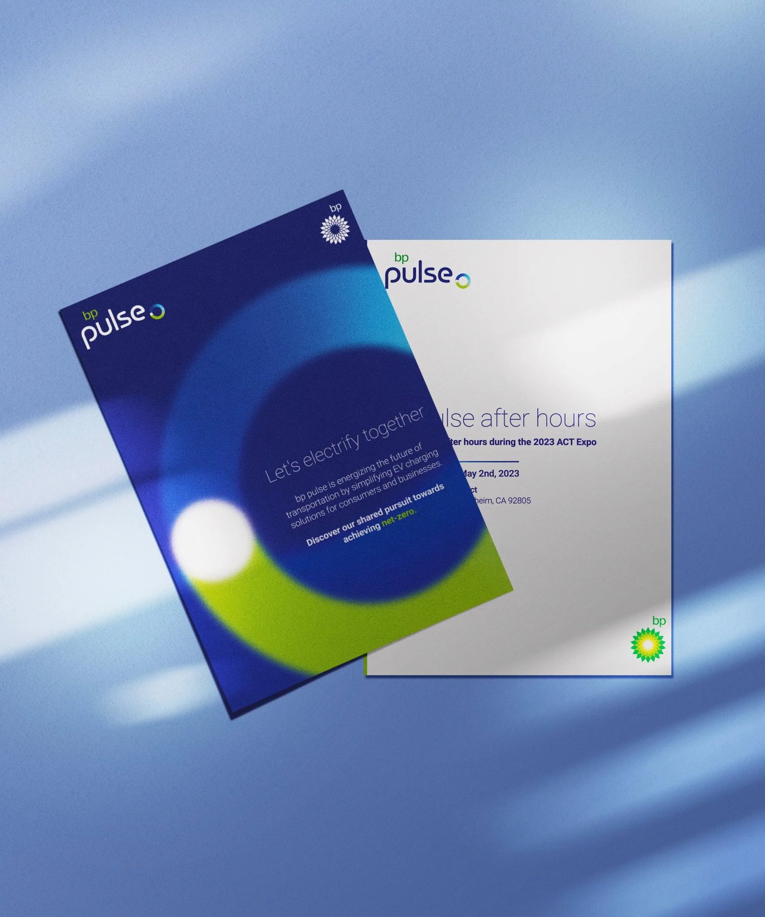
Brochures and product sheets lead with bp pulse blue and clean product photography, keeping complex charging offers easy to scan.
Thank you.
Daniel Cortez · Visual Designer · danctz@outlook.com