Brand Identity · bp pulse
Perks Brand Guidelines
Perks is the loyalty and rewards experience for bp pulse EV drivers. This guide defines the identity I designed for it: logo, color, typography, key visuals, voice and the product applications that bring it to life.

Brand Book · Version 2.0
Brand
Guidelines
The loyalty and rewards experience
for bp pulse EV drivers.
2026
Contents
Inside this guide
01
Brand Overview
05
Graphics & Imagery
02
Logo
06
Voice & Tone
03
Color
07
Do’s & Don’ts
04
Typography
08
Applications


02
01 · Brand Overview
What Perks is
Perks is the loyalty and rewards experience connected to bp pulse. It adds value to EV charging through exclusive benefits, offers and partner integrations.
Every charge becomes a reason to come back, building loyalty that goes beyond the transaction.
Exclusive benefits
Member-only access and experiences
Charging offers
Savings on every kWh
Partner integrations
Linked accounts such as Amazon Prime
03
01 · Brand Overview
Who Perks is for
Core audience
bp pulse customers
EV drivers who already charge on the network and should feel rewarded every time they plug in.
Growth audience
Drivers new to the network
EV drivers introduced to bp pulse charging through partner programs such as Amazon.
What they need
Value they can see
Offers that are easy to find, simple to redeem and clearly worth it.
04
01 · Brand Overview
How Perks should feel
Rewarding
Customers feel valued and appreciated.
Is: generous, celebratory
Isn’t: gimmicky, pushy
Effortless
Benefits are easy to discover and use.
Is: clear, quick, simple
Isn’t: fine print, hoops
Modern
Connected to the future of electric mobility.
Is: bright, digital, fresh
Isn’t: techy jargon
Trustworthy
Backed by the bp pulse brand.
Is: honest, transparent
Isn’t: vague, overpromising
05
Brand promise
Every charge comes with something extra.
Perks makes EV drivers feel rewarded, simply and honestly, every time they plug in.
02 · Logo
The primary logo
A lowercase “perks” wordmark in Perks Navy, followed by the looping gradient ribbon. Use this lockup wherever space allows.
07
02 · Logo
Construction & proportion
Every measurement is a multiple of X, the wordmark’s x-height, so the logo scales without drifting.
4.6X
¼X
2X
6.8X
X
Ascender
x-height
Baseline
Descender
Unit
X = x-height
height of the “e”
Ribbon mark
2X × 2X
ascender to descender
Gap
¼X
between “s” and mark
Lockup
6.8X × 2X
ratio 3.4 : 1
08
02 · Logo
Logo elements
Wordmark
Custom lowercase letters with rounded terminals. Always Perks Navy or white; never retyped.
Ribbon mark
A gift ribbon in motion. Use alone for app icons, avatars and small spaces.
App icon
The mark centered on white, filling about 70% of the tile.
09
02 · Logo
Clear space & minimum size
Clear space
Keep a margin equal to the height of the letter “e” (x) on every side. Nothing enters this zone.
Minimum size
Digital: lockup 120 px wide, mark 24 px
Print: lockup 30 mm wide, mark 8 mm
actual size
10
02 · Logo
Co-branding with bp pulse
Perks is a bp pulse experience. When both appear, bp pulse leads, separated by a thin vertical rule.

Order
bp pulse first, Perks second.
Scale
Match the wordmarks’ x-heights.
Divider
A 1 pt rule, 1.5× the logo height.
Reversed
Lime “bp”, white “pulse” on dark and key visuals.
11
02 · Logo
Color versions
Full color · primary
Reversed · on Midnight
Reversed · on dark

On soft gradient

One color · navy

One color · white
12
02 · Logo
Logo misuse

✕ Don’t recolor
✕ Don’t stretch or squash
✕ Don’t rotate
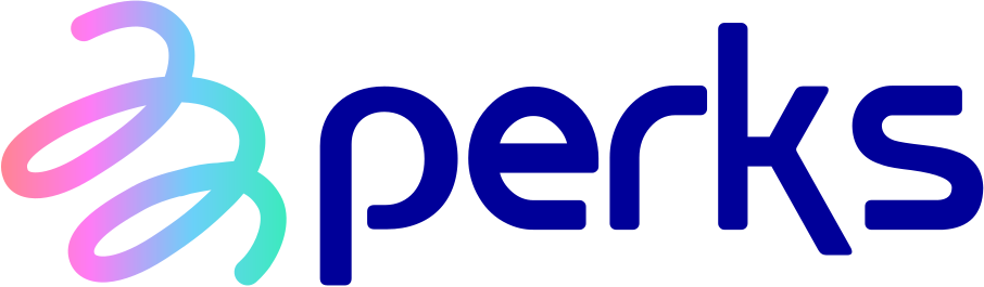
✕ Don’t rearrange
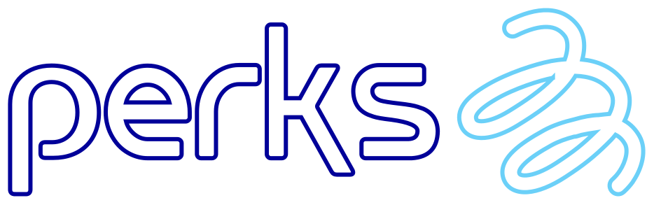
✕ Don’t outline
✕ Don’t place on loud color
13
03 · Color
Brand palette
A calm base of Midnight and Paper lets the logo’s navy and ribbon colors do the talking.
Midnight
#0A0B3D · RGB 10 · 11 · 61
Dark backgrounds, headlines
Perks Navy
#000099 · RGB 0 · 0 · 153
Logo, links, accents
Paper
#F7F5F2 · RGB 247 · 245 · 242
Light backgrounds
Coral
#FF8493
Orchid
#FF7BF5
Sky
#6BD0F8
Mint
#3CEABE
14
03 · Color
One gradient, three uses
Ribbon
Coral · Orchid · Sky · Mint at 0, 31, 67, 100%. The mark, the pulse line and thin accents.
Tint
The ribbon at 15% on Paper. Hero and card backgrounds behind navy type.
perks
Glow
Navy glowing into Midnight. Covers and moments of celebration.
15
03 · Color
Neutrals, UI & proportion
Neutrals
Ink
#1E2050
Slate
#56556B
Stone
#ECE8E1
White
#FFFFFF
UI only
Active
#CCFF33
Partner
#1E6BF0
Alert
#A3164F
Proportion in a typical layout
Perks Navy and the ribbon together stay near 10%. UI colors appear only in product states, never in marketing layouts.
16
04 · Typography
Brand typeface
Aa
Roboto
One family for everything: open, friendly and highly legible in the app and at large sizes.
Light 300
Subheads, intro text
Regular 400
Body, UI
Medium 500
Headlines, buttons
Bold 700
Prices, key numbers
17
04 · Typography
Type hierarchy
Display
Medium · 96 · gradient
Download
Headline
Medium · 56 · navy
Drive smarter, save more
Subhead
Light · 40
Make the smart choice with bp pulse perks
Body
Regular · 28
Link your Prime account to save on every charge at 7,000+ stations.
Button
Regular · 24 · pill
Download the App
18
05 · Graphic Elements
The pulse line
A charging cable that turns into a heartbeat. It travels flat, then pulses up and down in rounded loops, leading the eye to the product.
Stroke: constant weight, rounded ends and corners
Color: the ribbon gradient, Coral to Mint
Flow: enters from an edge, ends behind the hero
19
05 · Imagery
Photography
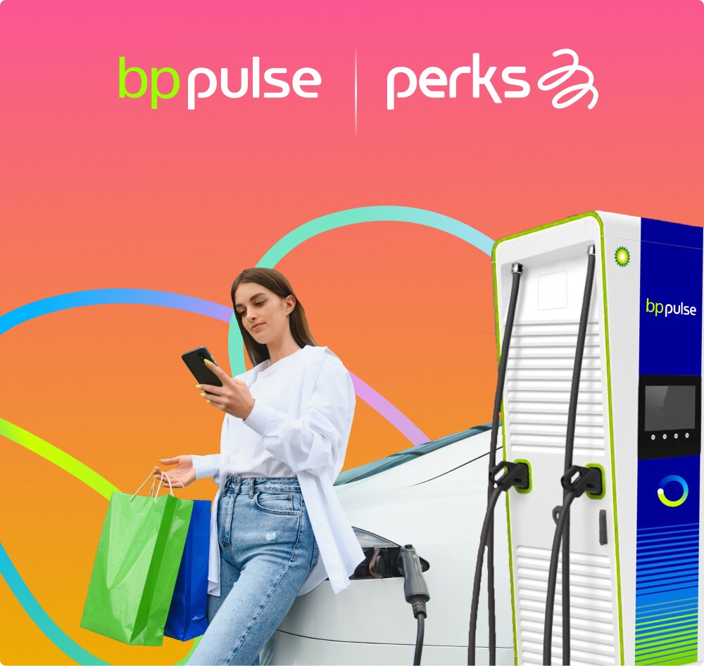
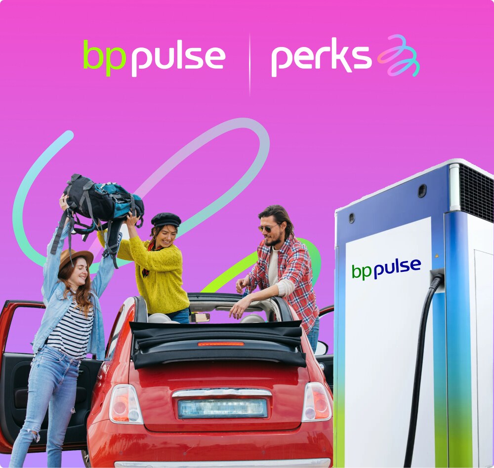
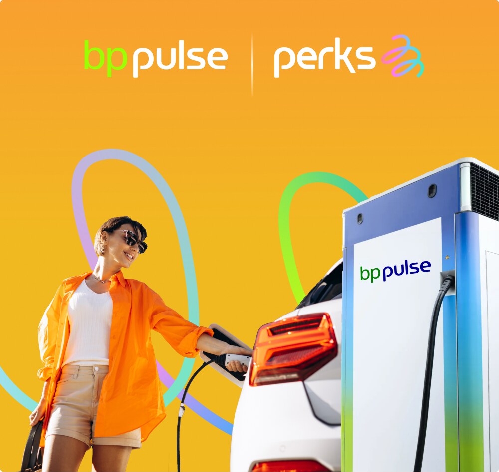
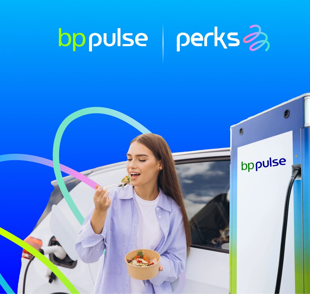
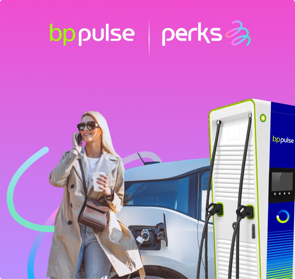
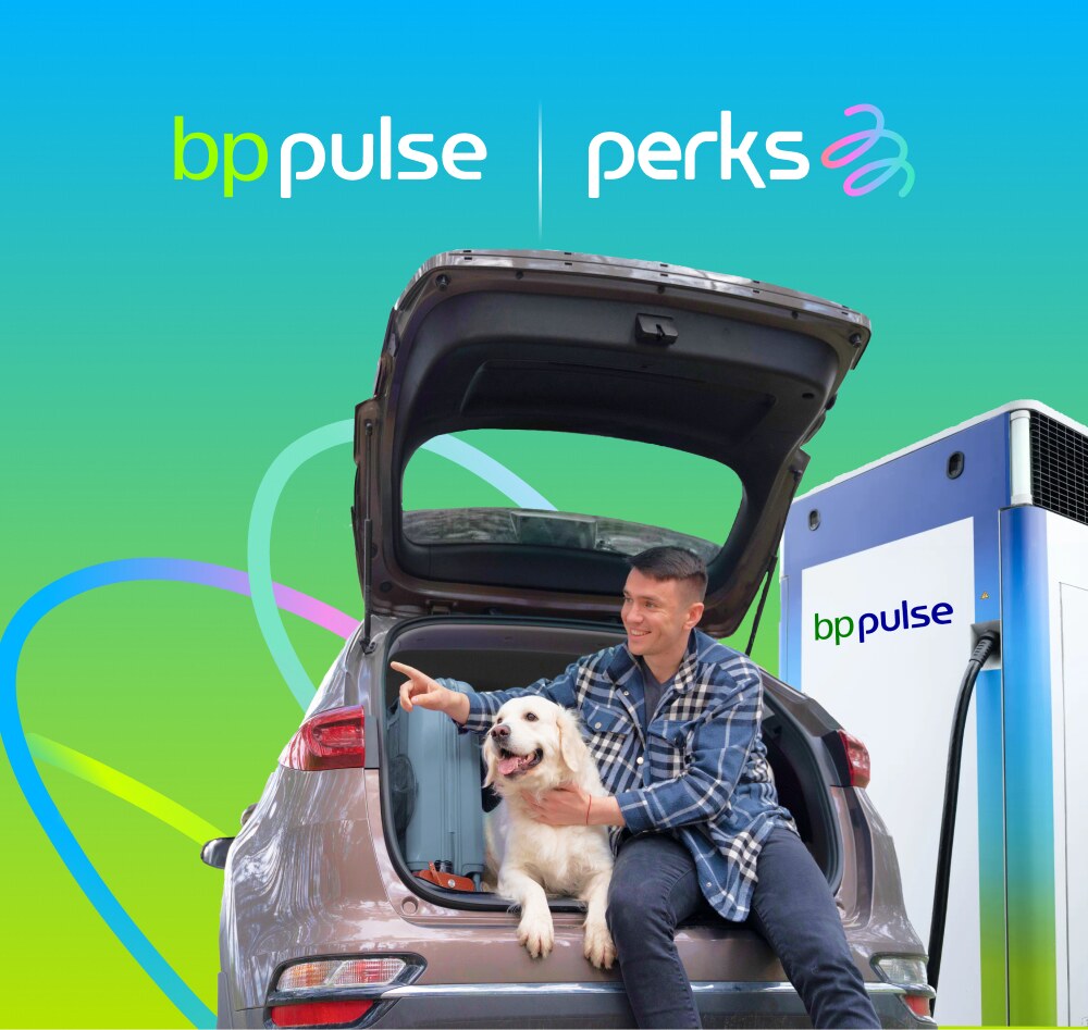
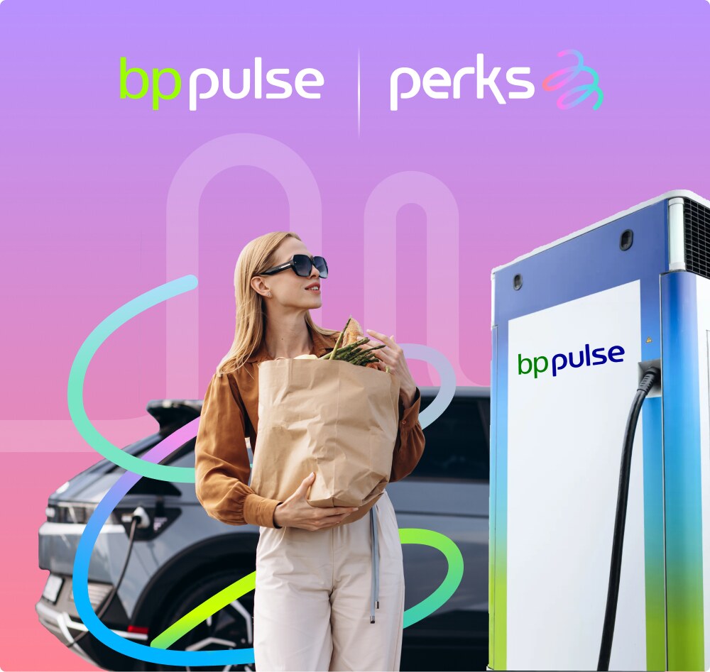
Real drivers enjoying the moment, with the car and the charger in frame. Bright daylight, clean backgrounds and brand color in the scene.
Candid, upbeat, people first
Ribbon or pulse line woven behind
Warm daylight, soft tint backdrops
Avoid dark, moody or staged stock
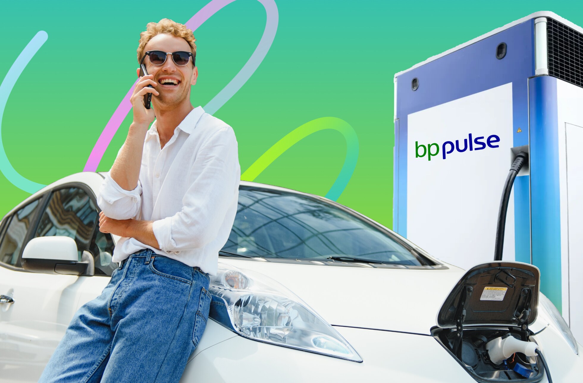
Example from the bp pulse perks app
20
05 · Key Visuals
People, power
and a little extra
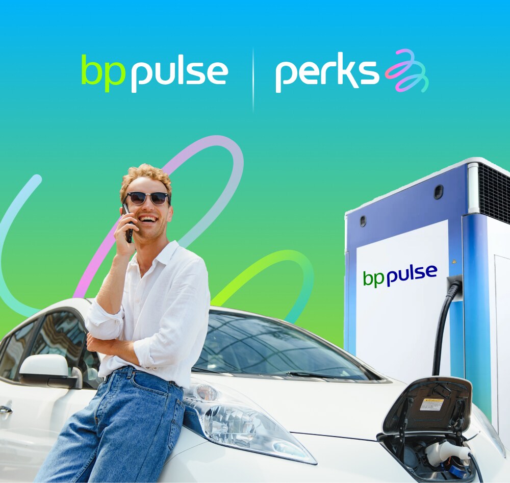
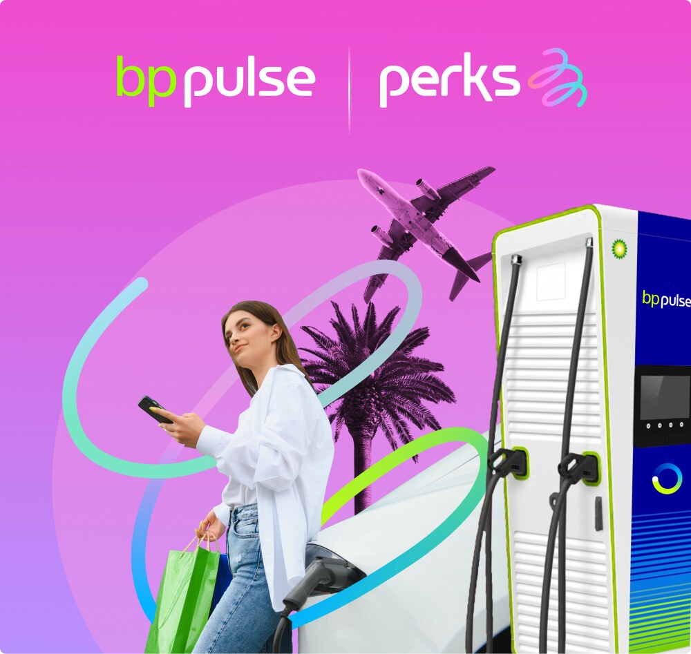
Every Perks key visual brings people and technology together: a driver enjoying the moment, an EV plugged into a bp pulse charger, and the Perks ribbon looping through the scene on a bright gradient.
Offers & Promotions Key Visuals · V 1.0
21
1
2
3
4
5
05 · Key Visuals
Anatomy of a key visual
1
Co-brand lockup, white, top center
2
Campaign gradient, vertical, full bleed
3
Ribbon loops weaving behind the person
4
Hero person, cut out, mid-moment with phone
5
bp pulse charger anchoring the right edge, EV plugged in
22
05 · Key Visuals
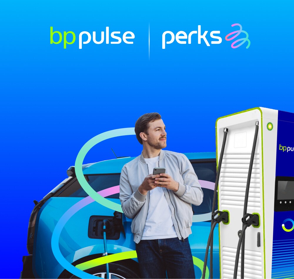
The key visual family
One formula, many moments: shopping, travel, food, family and road trips.
23
05 · Key Visuals
Campaign backgrounds
Six vertical gradients, for key visuals only. Pick one per visual and rotate them across a campaign.
Magenta Bloom
#EE4FD0 → #BA8EFD
Fresh Charge
#07B5F4 → #7ED957
Electric
#00ADF9 → #020DFF
Coral Sunset
#FB588F → #ECA809
Golden Hour
#F8A12E → #F0B920
Lavender Rose
#BB90FC → #FC8598
24
06 · Voice & Tone
How Perks sounds
Warm, upbeat and to the point. Lead with the benefit, then make the next step obvious.
| Trait | We say | We don’t say |
|---|---|---|
| Rewarding | “Drive smarter, save more.” | “Limited-time deal, act now!!!” |
| Effortless | “Link your Prime account to save.” | “Complete the following steps to activate your benefit.” |
| Modern | “Take your electric journey further.” | “Leverage synergistic e-mobility solutions.” |
| Trustworthy | “Save at 7,000+ stations.” | “Some restrictions may apply.” |
25
07 · Do’s & Don’ts
Keeping Perks consistent
Do
- Lead with Paper, Midnight and space
- Use the exact logo files, never retype “perks”
- One pulse line or ribbon per layout
- Show offer terms plainly, next to the offer
- Pair with bp pulse to signal trust
Don’t
- Add new gradients or use UI colors in ads
- Set body copy in gradient or ribbon colors
- Crowd the logo inside its clear space
- Cross text with the pulse line
- Hide terms behind “restrictions apply”
26
08 · Applications
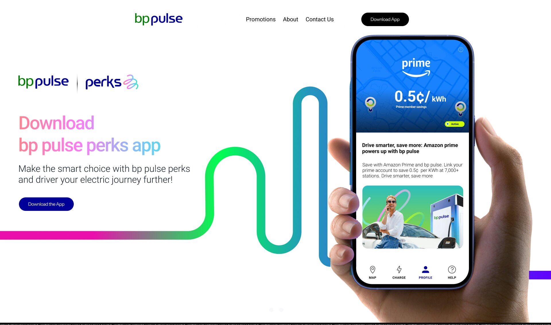
Landing page
The whole system at work: co-brand lockup, gradient headline, navy pill button and the pulse line leading to the app.
27
08 · Applications
Partner offer card
The offer screen puts the partner and the saving first, then explains the benefit in one plain sentence.
Header
Partner color and logo, rate in Bold
Status
Volt #CCFF33 pill
Image
Key visual, 24 px corners
Type
Roboto Bold headline, Light body
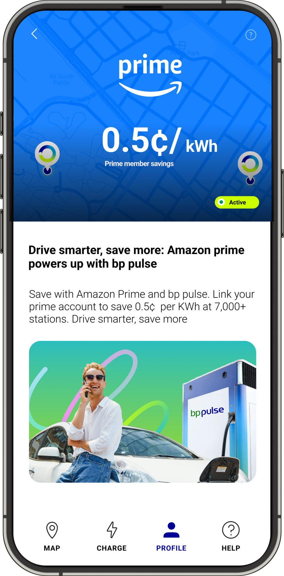
1
Partner header
Rate is the hero
2
Status chip
Shows it’s live
3
Benefit copy
Headline + terms
4
Key visual
Driver, car, charger
5
Tab bar
Active tab in navy
28
Thank you
Questions about the brand? Contact [brand team email]
Brand design: Daniel Cortez